Urban Air Quality Sensors: From Smart Placement to Meaningful Public Data
Across busy streets, quiet neighborhoods, and sheltered courtyards, tiny airborne particles shift more than most people realize. Affordable connected devices now track these changes block by block, revealing patterns shaped by traffic, trees, buildings, and weather. Once‑hidden differences in exposure can start to look like practical, shareable knowledge for residents, planners, and community groups.
This story is part of DailySeekers's practical reading library across everyday topics.
Why One Street Can Have Many Different Skies
Traffic, buildings, and the “shape” of bad air
Stand at one end of a block and you might be next to idling vehicles, a junction where engines keep restarting, or a loading zone. Walk just a short distance and you could be by a quiet side street, a courtyard, or a small patch of green. The air people breathe in these nearby spots can be strikingly different.
The layout of streets and buildings helps explain this. Tall, closely packed walls can act like a canyon, slowing how fast exhaust, brake and tire particles, or fumes from local industry disperse. In contrast, wider streets, gaps between buildings, and pockets of trees tend to allow more mixing, which can dilute some pollutants.
This is why two corners of the same block can show very different readings at the same time. One small device might sit in a sheltered alley where pollution lingers; another, only a short distance away, might be in moving air that clears more quickly. The contrast often reflects how urban form and nearby activity shape air flow.
Wind, time of day, and moving “clouds” of pollution
Airborne particles do not stay put. They drift and pool with the wind, forming slow, invisible “weather systems” on the scale of a few streets. A corner that feels relatively clean in the morning can become a hotspot later in the day when the wind shifts or traffic patterns change.
Queues of vehicles during the commute or short bursts of activity around loading docks can create brief, sharp spikes. A single, distant reference station might average those spikes out or miss them entirely.
Dense, local networks are better at catching these moving pockets along the exact routes people walk, cycle, or drive. When two nearby devices seem to disagree, they may both be right: one is inside a passing “cloud” of particles, while the other is just outside it.
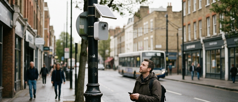
From Lamp Posts to Rooftops: Placing Small “Air Sentinels”
Height, distance and wind: why the exact spot matters
Compact monitoring boxes rarely sit in ideal textbook locations. A device on a lamp post above a busy pavement, one on a balcony, and one on a rooftop corner will all “see” different slices of the atmosphere.
Height is a major factor. Units high above the street tend to record a more mixed background picture. They are less dominated by one exhaust pipe or one kitchen vent and more by general conditions in the neighborhood. Devices installed closer to head height sit inside the “breathing zone” and feel plumes from traffic and cooking more directly.
Distance from obvious sources matters too. Place a unit just above a tailpipe, a restaurant chimney, or an outlet fan, and the readings may spike sharply whenever that one source is active. Moving it slightly away, while still keeping it near normal human activity, usually produces numbers that better represent the whole block rather than a single pipe.
Wind and shelter add another twist. A device tucked under a deep balcony or surrounded by walls and trees might capture trapped air that does not match the wider street. One on a free‑standing pole in open flow is more likely to track broader patterns instead of one stagnant pocket.
A simple way to compare mounting options is to think about what each position is really measuring:
| Mounting option | What it tends to capture | When it is most useful |
|---|---|---|
| Lower pole or lamp post | Breathing‑zone levels near roads and pavements | Understanding what people encounter walking, cycling, or waiting |
| Higher rooftop or mast | Mixed neighborhood background conditions | Comparing districts and spotting broad trends over time |
Combining different heights and distances helps fill blind spots. Street‑level units can show where people meet the highest peaks, while elevated ones keep an eye on wider shifts in particles and gases that affect whole areas at once.
Filling gaps between busy roads and quieter homes
Once obvious traffic corridors are covered, attention often turns to more mixed spaces: residential streets, courtyards, and paths that cut between buildings. These are places where many people spend time but where traditional monitoring has been sparse.
Shared city infrastructure can help bridge those gaps. Masts, utility poles, or other existing fixtures offer power and stable mounting points between highways and quieter homes. Placing units at a few different heights across these structures reduces the chance that important micro‑environments are missed.
The goal is not to measure every meter, but to build a realistic pattern. With a modest number of thoughtfully placed devices, planners and communities can see how air conditions shift from busy edges into the heart of a neighborhood.
When Numbers Meet Neighborhoods
From raw readings to real‑life questions
A small screen or phone app might show a concentration value or a color‑coded index. On its own, that number does not say much about daily decisions. People tend to care about questions like: Is this a good time to go for a run? Should a school think about keeping windows closed during a nearby construction project?
Local context is what turns raw readings into something more like a story. Brief explanations such as “higher than usual for this street at this time of day, mainly linked to road traffic” are easier to relate to than a list of measurements. Adding a clear health frame—who might want to reduce outdoor time, which steps can help indoors—turns those stories into practical guidance.
Making neighborhood patterns feel human
Dense networks can reveal sharp contrasts inside a single community: a busy bus route with elevated readings, a sheltered courtyard that stays relatively cleaner, or a corner that regularly spikes when deliveries arrive. When residents recognize their own routines in those patterns, the data feels less abstract.
Comparisons before and after a change often resonate strongly. People can watch how readings shift when a new traffic rule starts, a temporary closure moves vehicles elsewhere, or smoke drifts in from distant fires. Visual tools that show “usual level,” “today,” and a simple recent trend line help answer a basic question: is the pattern improving, worsening, or just moving around?
Community projects sometimes invite residents to check dashboards, share screenshots, or add short notes about what they notice: smells, visibility, or comfort. When those personal observations sit next to sensor curves and broader information about regional smoke or dust, local experience connects to a larger picture.
A simple way to think about different uses of neighborhood data is:
| Use case | What people look for | How sensor insight can help |
|---|---|---|
| Daily planning | Choosing when to exercise or open windows | Highlighting cleaner and dirtier hours on familiar routes |
| Longer‑term advocacy | Discussing street design, traffic, or green space | Showing patterns that line up with specific locations or routines |
The same set of readings can support both short‑term choices and longer conversations about how space is shared and managed.
Limits, Blind Spots, and Better Questions for Any Air Map
The limits of a smooth color on a map
Many popular maps show a city shaded in simple colors. They often rely on a small number of carefully maintained stations. Those stations are excellent at tracking long‑term trends and legal thresholds, yet they sit in fixed places and cannot fully capture every busy canyon, industrial edge, or heavily used junction.
Time smoothing adds another blind spot. A daily or hourly average may look acceptable even when short, sharp peaks pop up in the middle of the afternoon, during sport, or while people wait for transport. The opposite can also happen: a worrying‑looking daily number might hide the fact that mornings are relatively cleaner than evenings.
Indoor conditions make things more complicated. A map might show moderate outdoor values while carbon dioxide, particles, or fumes from cleaning products build up inside a poorly ventilated room. The reverse can happen when outdoor spikes are softened indoors by filters or by distance from the main sources.
Better questions to ask
Instead of stopping at “Is the air good today?”, it helps to ask more targeted questions that connect maps, devices, and personal spaces:
- Where are the monitors that feed this map, and what types of streets or buildings are not covered?
- How might levels differ at my usual pavement, bus stop, school entrance, or playground compared with the nearest unit?
- At what time of day are spikes most likely, and does that overlap with school runs, outdoor sport, or commuting?
- How do outdoor conditions interact with my indoor space, including ventilation, crowding, and any filtration?
Combining information from reference stations, low‑cost street‑level devices, and simple indoor measurements such as carbon dioxide can create a more rounded picture. With that broader view, people and institutions can make calmer, more realistic adjustments: shifting the timing of strenuous activity, choosing quieter routes where possible, or improving everyday ventilation and filtration.
Rather than treating any single color, number, or gadget as a final answer, it is more helpful to see them as tools for asking better questions about how air moves through urban life—and how that movement intersects with the places where people actually spend their time.
Q&A
-
How do urban air quality sensors differ from traditional pollution monitoring devices in cities?
Urban air quality sensors are typically smaller, cheaper, and easier to deploy than traditional reference‑grade pollution monitoring devices. They trade some precision for coverage and real time data collection, allowing dense city environment tracking that highlights street‑level variation and short pollution spikes relevant to daily exposure and behavior. -
What kinds of pollutants and metrics can these devices measure in real time?
Most low‑cost sensors measure particulate matter such as PM2.5 and PM10, offering particulate matter awareness that older networks often lack at fine scales. Some also track nitrogen dioxide, ozone, temperature, and humidity. Real time data collection helps identify short‑term events, traffic surges, and local sources that longer averages can hide. -
What are the basic principles of sensor placement in an urban environment?
Sensor placement basics focus on avoiding extreme micro‑sources, placing devices within the human breathing zone, and ensuring reasonable air flow around the inlets. Sensors should not be mounted right on exhaust vents or windows, and city environment tracking works best when devices cover typical walking routes, parks, schools, and transport hubs. -
How can residents and city planners make practical use of public data from air sensors?
Public data use includes informing daily choices like exercise timing, window opening, and route selection, and supporting planning decisions on traffic calming or green buffers. When open data from multiple pollution monitoring devices is combined with maps and simple explanations, it becomes a shared evidence base for local policies and investments. -
What are common limitations of low‑cost urban sensors and how can users interpret their data wisely?
Low‑cost sensors may drift over time, react to humidity, or misread certain particle types, so their absolute values require caution. However, they excel at showing patterns and relative changes. Comparing multiple urban air quality sensors, checking against official stations, and focusing on trends rather than single readings helps avoid misleading conclusions.