Read the Label, Change the Cart: Turning Nutrition Facts into Smarter Grocery Choices
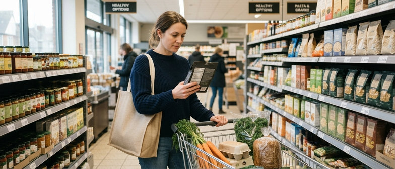
At the grocery store, packaging can be confusing while the small black‑and‑white panel quietly holds the details that matter most. Learning to scan this information reveals how much you are likely to eat, which nutrients show up in meaningful amounts, and how different products truly compare.
This story is part of DailySeekers's practical reading library across everyday topics.
Start With What You Actually Eat
Looking mostly at the front of the package makes it easy to miss the details that affect your plate. The small box on the back starts with a line that changes everything: the amount that all the numbers are based on.
If that top line lists a certain portion and the package contains more than one, every number below multiplies when you finish the whole thing. A snack that lists a modest energy number per portion can add up quickly if you treat the entire container as one helping.
Before opening anything, pause at that line and ask, “How much will I actually eat?” If the answer is “about twice this,” then double the figures for energy, sugars, and other nutrients in your head. “Two times this” or “three times this” can better reflect your usual plate.
Portion Size Versus What Goes On Your Plate
The amount printed on the panel is a standard reference chosen for the product. The amount that lands in your bowl, glass, or hand is personal, and they often do not match.
Pouring cereal is a common example. The panel may assume a small bowl, while your everyday serving fills a much larger one. That “one normal bowl” can easily equal two or more listed portions.
The same mismatch shows up with bottled drinks, snack bags, frozen dishes, and other convenience foods. A bottle that looks like a single drink may hide more than one portion. A “share” bag of crisps can turn into several servings once the bottom of the bag appears.
Noticing this gap simply makes the numbers more honest, so your food choices line up better with your personal health goals.
A Simple Portion Check You Can Reuse
A quick routine helps keep this practical:
| Step in the routine | What to ask yourself | Why it helps in real life |
|---|---|---|
| Look at the amount line first | “Is this close to what I usually eat?” | Stops you from underestimating what ends up on your plate |
| Adjust in your head | “If I eat twice this, what changes?” | Gives a nearer picture of total energy, sugars, and fats |
| Decide on your portion | “Do I want the whole pack or part of it?” | Turns the label into a guide instead of a surprise later |
Used regularly, this habit makes the rest of the panel easier to understand.
Seeing More Than Just Energy Numbers
When eyes first land on the panel, they often stop at the large energy number. A clearer approach is to scan three things in order: the amount line, the main nutrient groups, and which items look especially high or low.
The amount line comes first because every figure underneath depends on it. If a container looks like a single portion but lists more than one, all the values multiply if you finish it.
Next come the big three: fats, carbohydrates, and protein. Many panels show a percentage alongside each, giving a rough idea of whether the amount is low, moderate, or high for a typical adult pattern. It is not fully personalized, but it acts like a gentle traffic light when comparing similar products.
Fats, Carbs, Protein, and Key Extras
For fats, start with total fat, then glance at saturated fat. A smaller saturated fat value often fits better into everyday patterns that aim for balance. Some panels also list trans fat; many people treat any presence there as a sign to keep that food as an occasional choice.
For carbohydrates, do not stop at the total figure. Scan sugars and fibre. When fibre is higher and total carbohydrates are moderate, the food may be digested more slowly and feel more sustaining. Where listed, added sugars separate those that come from fruits, milk, or grains from those added during processing.
Protein tends to be straightforward: more protein per listed portion can help some people feel satisfied for longer, especially in snacks and quick meals.
Finally, look at the vitamins and minerals section. The percentages here are especially useful. A snack or staple that looks average on energy might offer meaningful amounts of nutrients such as certain minerals or vitamins. When choosing between two similar products, this can tilt your decision.
Using Percentages To See “High” and “Low” Quickly
The percentage column can take the place of mental arithmetic. For a typical adult, values around the low single digits per serving are often viewed as “low,” while much higher percentages signal that the food is a major contributor for that nutrient.
That pattern means you rarely need to track grams or milligrams. If the percentage for fibre stands out on one cereal and barely appears on another, you can see the difference at a glance. The same goes for nutrients you prefer to limit, such as saturated fat, sodium, or added sugars: a noticeably lower percentage can be a useful sign when you are choosing between similar options.
Putting Percentages to Work When Comparing Foods
Percentages become most powerful when you hold two products side by side. Rather than comparing grams across different portion sizes, you can follow the same row and see which percentage is higher or lower.
For nutrients you want more of in your day, such as fibre or certain vitamins, a higher figure per listed portion can be a positive point. For nutrients you prefer to keep modest, a lower percentage may better match your aims.
Checking That Comparisons Are Fair
Before relying on those comparisons, check that the portion sizes are reasonably alike. One snack might list a small portion while another lists quite a large one. The first can look better on paper even if you usually eat more than one of its portions.
When a panel offers values for a standard weight as well as per serving, that extra column can help. It gives a side‑by‑side comparison based on the same amount of food, even if the suggested portions differ.
A simple mental checklist when you compare:
| What to compare | What to look for | How it influences your choice |
|---|---|---|
| Portion size | Are they similar, or is one much smaller? | Prevents being misled by “good” numbers for tiny servings |
| Percentages for nutrients to limit | Which product is clearly lower? | Helps reduce things like very salty or very sweet options |
| Percentages for nutrients to get enough of | Which product shows more per similar portion? | Steers you toward foods that contribute more benefit per bite |
With a bit of practice, this becomes a quick filter rather than a lengthy calculation.
From Panel to Cart: A Simple Routine for Every Aisle
Turning that small box into a practical tool is mainly about habits. A short routine before anything goes into the cart can keep choices calm and consistent.
First, look at the portion line and compare it with what you usually eat. If you expect to eat more, roughly scale up the key numbers in your head. Then glance at energy, saturated fat, sugars, sodium, and fibre, based on what matters most in your own pattern. When comparing two similar products, the panel can act like a tie‑breaker.
Letting the Ingredients List Support Your Decisions
Beneath or beside the main panel, the ingredients list adds context the numbers cannot show. Items are usually listed in order by weight, so the first few lines reveal what the product mostly consists of.
When those early ingredients are familiar whole foods, it may be easier to fit that product into a simple, balanced style of eating. If the early lines are dominated by refined starches, added fats, or several types of sweeteners, that can be a cue to pause and think about how often you want that item in your routine.
The ingredients list can also help you:
- Notice when sweeteners appear several times under different names.
- Spot where salt or salty additives show up in the order.
- See added fats that may push up saturated fat on the panel.
A calm, consistent look at the panel and the ingredients nudges your cart toward options that feel better aligned with your everyday health priorities. Over many small trips, those nudges can gradually reshape what ends up on your plate, without needing strict rules or complex calculations.
Q&A
-
How can Nutrition Label Reading really improve everyday Smarter Grocery Choices?
Effective label reading turns impulse buying into informed selection by showing how a food fits into your overall day, not just a single meal. By scanning serving size, calories, key nutrients, and ingredients together, you can swap similar products for ones with less sodium, more fibre, and fewer highly processed additives. -
Why is Serving Size Awareness essential before judging if a product is healthy?
Serving size awareness prevents you from underestimating energy, sodium, and added sugar intake. Many products seem moderate per serving but are usually eaten in double portions. Matching the label’s serving to your real plate lets you mentally adjust numbers, so you avoid hidden excess and can fairly compare foods across brands. -
What is a practical way to do an Added Sugar Review on packaged foods?
Start by checking grams of total sugar, then look for a separate “added sugar” line. Next, scan the ingredient list basics for multiple sweetener names, like syrups or concentrated juices. Favor items where sweetness mainly comes from whole fruits or dairy and where added sugars are low relative to fibre and protein. -
How do Sodium Comparison Tips help when choosing between similar products?
When two foods play the same role in your meals, prioritize the one with a lower sodium percentage per comparable serving. Then, check the ingredient list for salty additives such as broths, flavor enhancers, or cured meats. Consistently choosing lower‑sodium versions gradually reduces your usual intake without changing your overall menu. -
Why should Fiber Content Checks and Ingredient List Basics be used together?
High fibre on the panel is most valuable when the ingredient list shows whole grains, legumes, nuts, seeds, or vegetables near the top. This pairing suggests slower digestion and steadier energy. Using both checks steers you toward foods that are not just low in problem nutrients but also genuinely nourishing and filling.